python seaborn heatmap可視化相關(guān)性矩陣實例
方法
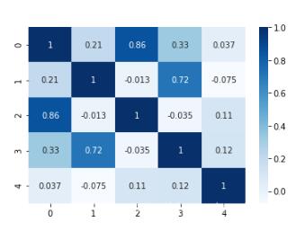
import pandas as pdimport numpy as npimport seaborn as snsdf = pd.DataFrame(np.random.randn(50).reshape(10,5))corr = df.corr()sns.heatmap(corr, cmap=’Blues’, annot=True)
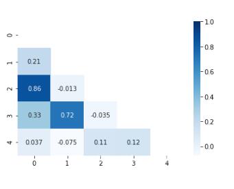
將矩陣型簡化為對角矩陣型:
mask = np.zeros_like(corr)mask[np.tril_indices_from(mask)] = Truesns.heatmap(corr, cmap=’Blues’, annot=True, mask=mask.T)
補(bǔ)充知識:Python【相關(guān)矩陣】和【協(xié)方差矩陣】
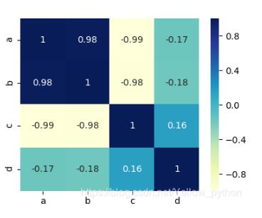
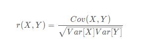
相關(guān)系數(shù)矩陣
pandas.DataFrame(數(shù)據(jù)).corr()
import pandas as pddf = pd.DataFrame({ ’a’: [11, 22, 33, 44, 55, 66, 77, 88, 99], ’b’: [10, 24, 30, 48, 50, 72, 70, 96, 90], ’c’: [91, 79, 72, 58, 53, 47, 34, 16, 10], ’d’: [99, 10, 98, 10, 17, 10, 77, 89, 10]})df_corr = df.corr()# 可視化import matplotlib.pyplot as mp, seabornseaborn.heatmap(df_corr, center=0, annot=True, cmap=’YlGnBu’)mp.show()
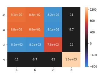
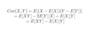
協(xié)方差矩陣
numpy.cov(數(shù)據(jù))
import numpy as npmatric = [ [11, 22, 33, 44, 55, 66, 77, 88, 99], [10, 24, 30, 48, 50, 72, 70, 96, 90], [91, 79, 72, 58, 53, 47, 34, 16, 10], [55, 20, 98, 19, 17, 10, 77, 89, 14]]covariance_matrix = np.cov(matric)# 可視化print(covariance_matrix)import matplotlib.pyplot as mp, seabornseaborn.heatmap(covariance_matrix, center=0, annot=True, xticklabels=list(’abcd’), yticklabels=list(’ABCD’))mp.show()
補(bǔ)充
協(xié)方差
相關(guān)系數(shù)
EXCEL也能做
CORREL函數(shù)

以上這篇python seaborn heatmap可視化相關(guān)性矩陣實例就是小編分享給大家的全部內(nèi)容了,希望能給大家一個參考,也希望大家多多支持好吧啦網(wǎng)。
相關(guān)文章:
1. Python 的 __str__ 和 __repr__ 方法對比2. IntelliJ IDEA設(shè)置默認(rèn)瀏覽器的方法3. Spring security 自定義過濾器實現(xiàn)Json參數(shù)傳遞并兼容表單參數(shù)(實例代碼)4. IntelliJ IDEA設(shè)置背景圖片的方法步驟5. docker /var/lib/docker/aufs/mnt 目錄清理方法6. Python TestSuite生成測試報告過程解析7. 學(xué)python最電腦配置有要求么8. JAMon(Java Application Monitor)備忘記9. Python Scrapy多頁數(shù)據(jù)爬取實現(xiàn)過程解析10. Python OpenCV去除字母后面的雜線操作
 網(wǎng)公網(wǎng)安備